The Bad: Parking Signs in Los Angeles
Parking signs in Los Angeles (LA) have been the epitome of information overload for decades. They’ve always been notoriously hard to understand, because the traffic rules are complex, resulting in the need to convey a lot of information in a small area.
How confusing are these signs? Traditionally, very—look at this example from the 2010s:
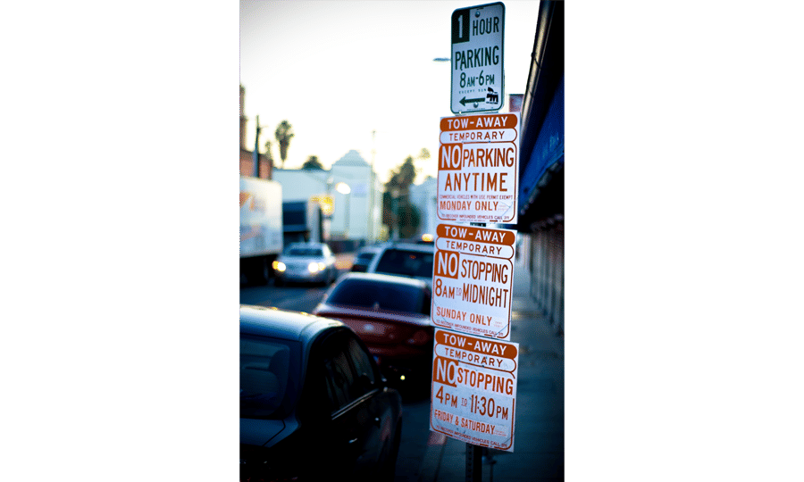 Author/Copyright holder: Jorge Gonzalez. Copyright terms and licence: CC BY-SA 2.0
As LA parking signs go, this example is already a pretty simple one.
Imagine you are a driver along this road on a Tuesday morning at 9 a.m. Can you park at this spot? What sounds like a simple question takes a lot of mental processing to answer.
As designers, we’re often faced with situations where we have to design for a lot of information to be displayed in a small space. The parking signs in LA might be an extreme case, but many times designing for mobile apps means facing the same problems. Is there a way out—for both the parking signs and designers in general?
The Good: Nikki Sylianteng’s Parking Sign
Designing a sign to display all the information, while being easy to understand, sounds like an impossible task. But that’s exactly what Brooklyn designer Nikki Sylianteng did.
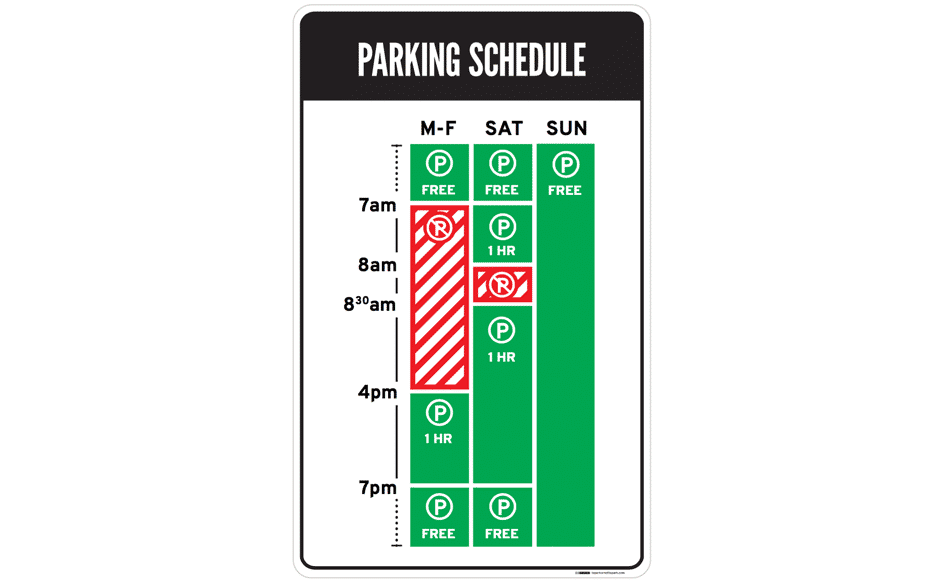 Author/Copyright holder: Nikki Sylianteng. Copyright terms and licence: CC BY-NC-SA 4.0
Nikki’s proposed parking sign was eventually used in LA as part of a trial run.
Part of why Nikki’s design1 works well is that it is user-centred: Nikki realised drivers simply want to know whether they can park at a spot. Yes or no—that’s all drivers needed, and that’s all the parking sign shows.
Her design also made use of visuals, rather than text, to convey information. The result is incredibly intuitive: green for OK, red for No Parking. It’s even designed for the colour blind, with stripes for No Parking.
Now when you look at the sign, you’ll know that on Tuesday at 9 a.m., parking is not allowed. The bars show what’s what at a glance—simple.
Lessons Learnt: Best Practice
- Understand what your users need, then design based on that. This helps reduce information overload.
- Have lots of information to convey to your users? Try using visuals instead of text. Learn more about data visualisation here.